
Meridian Presbyterian Church Logo
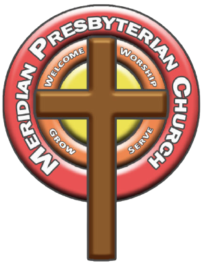
Our logo was unveiled in the Summer of 2012 as part of our mission statement as a church. While it may seem simple, there is actually tremendous meaning behind its design.
First, the 3 circles of the logo represents our belief in the Triune God Father, Son, and Holy Spirit. The red ring signifies the fire of the Spirit that calls us to action and spiritual awakening. The orange ring symbolizes the strength and endurance of God’s everlasting Word on which we stand and is our only rule for life and faith. Finally, the yellow is the light of the world in the person of Jesus Christ who redeems the world.
The cross is central to our identity as Christians. The empty cross is a constant reminder of our new life in Christ which has set us free from our lives of sin and calls us to a life of faithfulness. It also reminds us that to follow Jesus means to ‘take up our cross’ and follow him. To live out our mission to welcome, worship, grow, and serve we begin and end at the cross of Christ.
Our logo is a constant reminder of our mission. As we strive to live out our faith as a church we are constantly reminded of the work of the cross that sets us free and the Triune God who is constantly at work in our world.